Robert Richardson, ASC: On Color
The cinematographer shares the insights he’s gleaned over years while working alongside many leading colorists.
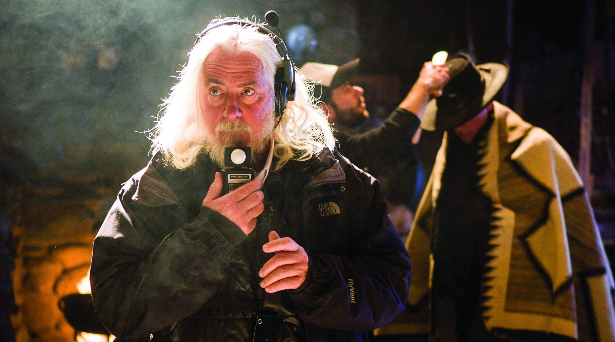
The bold approach to lighting and operating that Robert Richardson, ASC has brought to his work is matched by his courage in the grading suite, where the look, feel and texture of a picture comes together. Whether the cinematographer is shooting film or digital, it’s a process that begins long before his camera rolls, and it involves close work with the project’s final colorist. Throughout Richardson’s career, his collaborators have included Élodie Ichter, Yvan Lucas, Stephen Nakamura and Stefan Sonnenfeld.
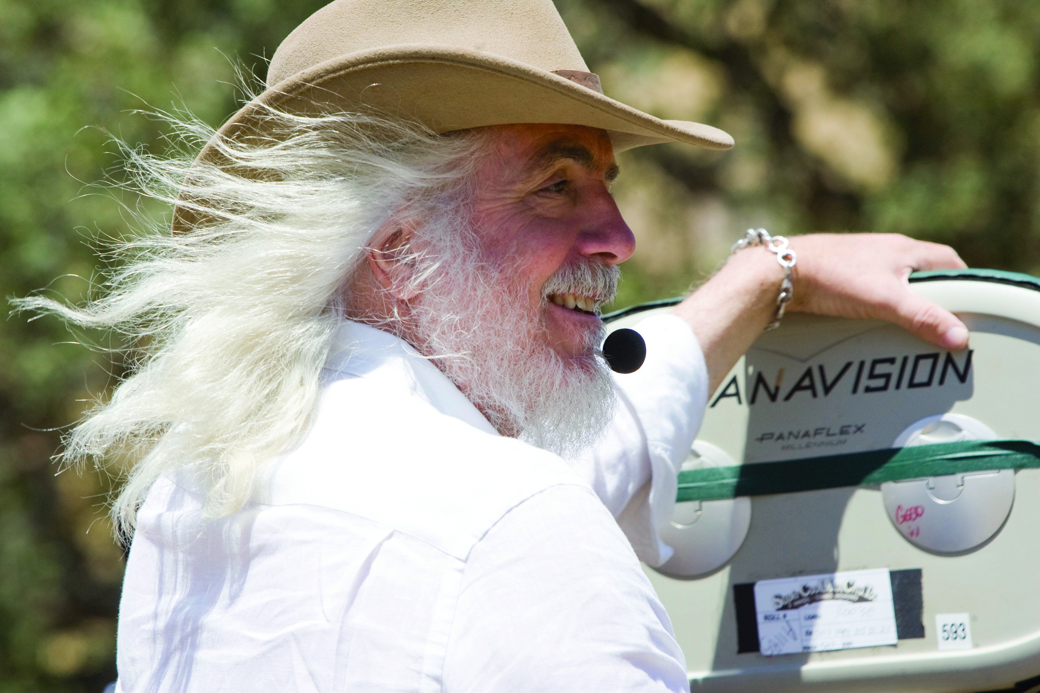
Richardson will help honor colorists’ creativity this month when he serves on the jury for the FilmLight Colour Awards at EnergaCamerimage 2024 in Poland. He and fellow judges Mandy Walker, ASC, ACS (the jury president); Catherine Goldschmidt, BSC; Erik Messerschmidt, ASC; writer-director George Miller; and Ichter, among other expert artisans, will consider colorists’ work in six categories: theatrical feature, television series/episodic, commercial, music video, spotlight (for lower-budget features or TV movies) and emerging talent.
“The FilmLight Colour Awards represent long overdue praise and respect for colorists,” Richardson says. “To take part as a jurist is an honor. Colorists are vital collaborators — you can’t make a film without one.”
AC recently connected with the cinematographer to discuss his philosophy about the past, present and future of color grading.
American Cinematographer: What was your first experience with the color-correction process?
Robert Richardson, ASC: It would have been Salvador [1986], which I shot with Oliver [Stone]. We were shooting in Mexico, and our lab was not of the highest quality, so dailies generally looked rather miserable. I’d say for my first four or five films, I was mediocre at best in terms of knowledge and how to communicate with a grader.
“After years of doing this, I’m more willing to take risks and make errors of judgment, which leads to a greater level of personal satisfaction with my work.”
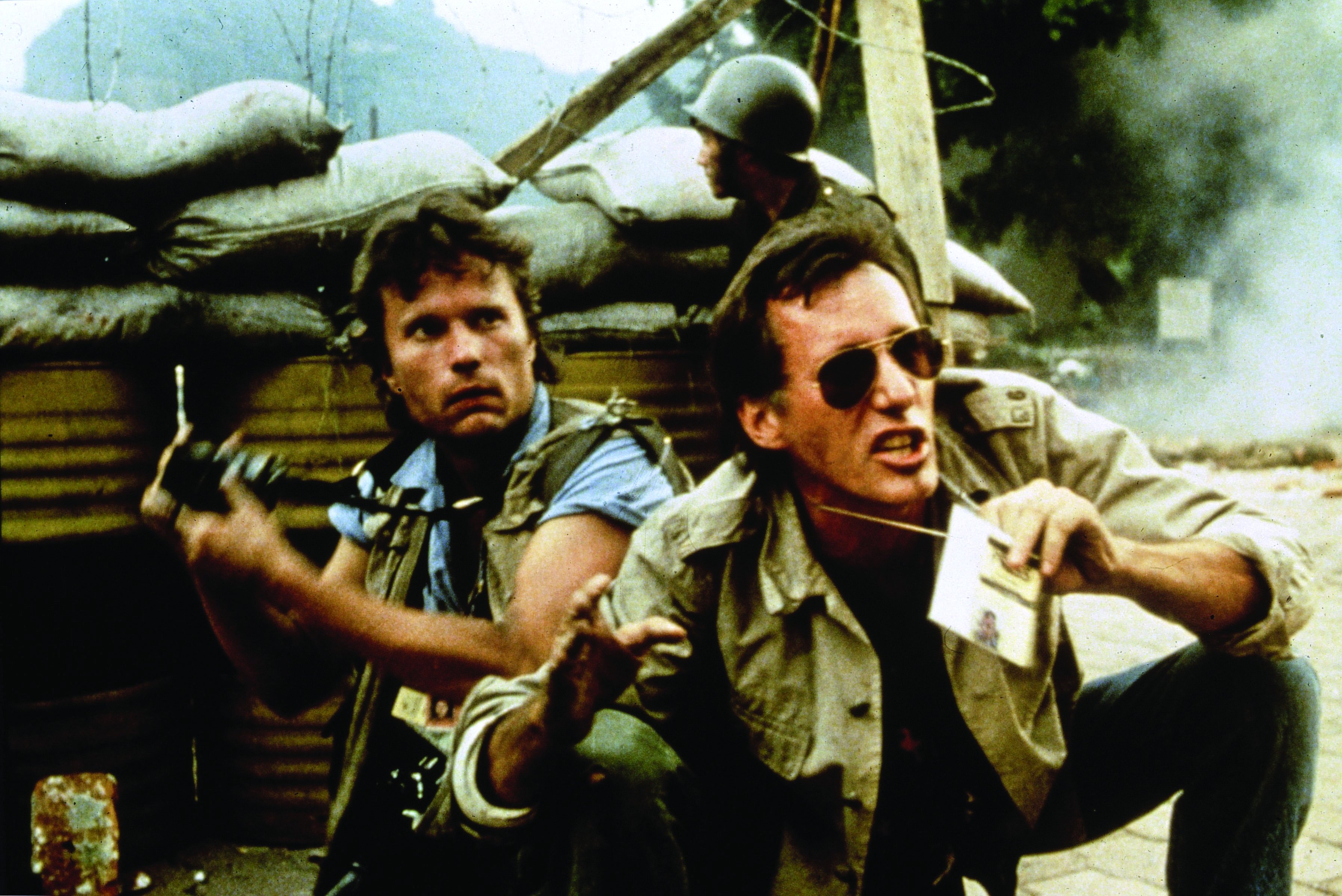
After years of doing this, I’m more willing to take risks and make errors of judgment, which leads to a greater level of personal satisfaction with my work. When you’re shooting and timing film, there’s always a question mark. Did you get it right? Did the lab get it right? There are so many issues you have to contend with that are solved by the digital process. The difference with the digital process is that the mystery is reduced by having a high-quality monitor on set. Most directors have video villages, so I’ll try to get a 65-inch or something large for the director and for crewmembers, and I want it tuned by the post house so that the image I have, especially when I’m operating a remote system, is exactly what I want, and the director and the producers see the same thing.
You see this as one of the advantages of shooting digitally?
It is to the benefit of the production, because we’re providing an image that is a lot cleaner and easier to show to networks or studios. We didn’t have that capability with film. You’d shoot the film, it’d be cut on a Steenbeck or whatever it was back then, and then you’d go to a screening room and see all of these flaws because the film was not always properly preserved. I saw a cut of Platoon [AC April ’87] six months after we shot it, and it was yellow.
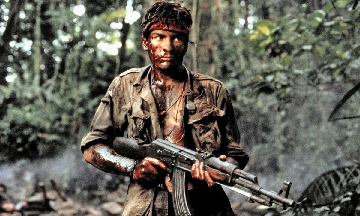
I said, ‘Oliver, are you happy with this?’ He’d been watching the same footage for months in the editing room, so he thought that was what the movie was supposed to look like. That also happened with a number of other films. It’s very hard to keep someone from falling in love with what they’re watching, so I want to give the director something that’s closest to our vision from the very beginning.
How do you do that?
For years now, for nearly every digital film I’ve done, I always try to get a colorist on the set or in a room close to the set. That way, I can go through the dailies every day either at lunch or during a break. This is one of the shifts you’re going to see in filmmaking: More color will be done on set.
What kind of grading are you doing on set?
Anything I would do in a color suite. It won’t be the same quality because you’re dealing with so much more material, but with a good colorist, the time spent in the final grade is reduced because you’ve already come much closer to the final look during the shooting process. The control factor of a [modern digital color session] is so immense it would be insane not to take full advantage of it.
In the past, shooting multiple film stocks and using special lab processing enabled you to create different looks. How did you creatively exploit that approach?
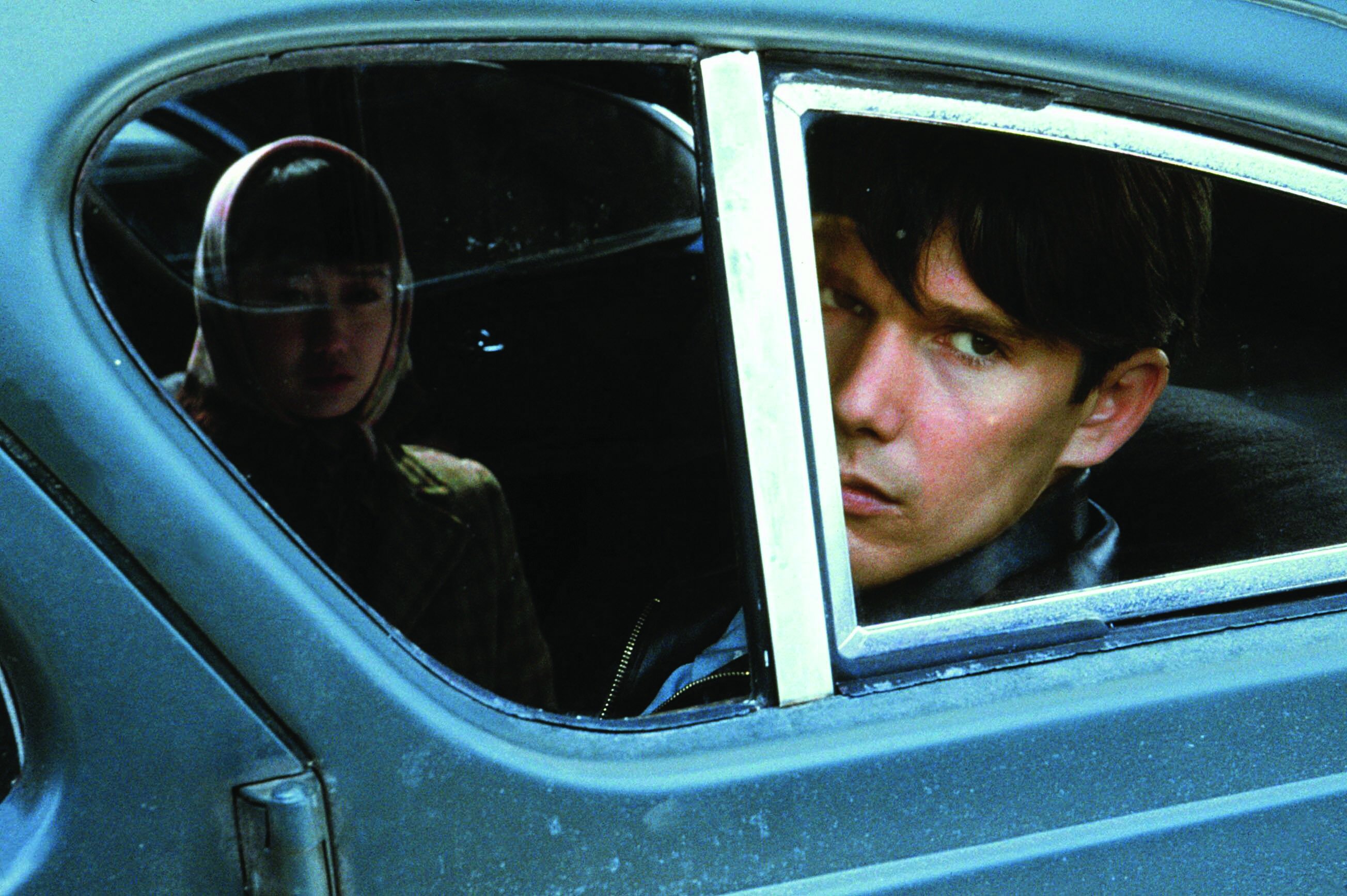
Super 8 and 16mm film stocks come with a look you cannot always predict. For Snow Falling on Cedars [AC June ’00], I was able to work with [dailies colorist Thor Roos] to get a bleach-bypass [process]on all the dailies, and it’s probably the happiest I’ve ever been in terms of working with the director and colorist closely to get ‘the look’ on film.
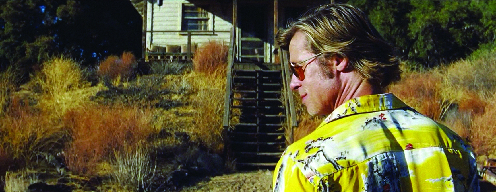
When Yvan and I were doing Once Upon a Time… in Hollywood [AC Aug. ’19], some of our film fell to the bottom of the developing tank. They recovered just a small section of it, and it came out looking so beautiful, like a Stan Brakhage film.
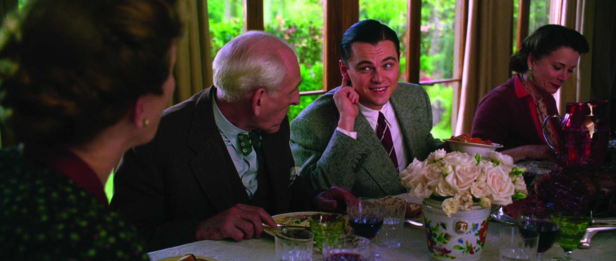
For The Aviator [AC Jan. ’05], Marty [Scorsese] wanted the look of the film to match the time periods depicted in the scenes, chronologically building from hand-tinting to two-color [Technicolor], to three-color [Technicolor], to panchromatic. The first time I saw the digital three-strip reproduction on film, I started to cry because it was so bad. It had too much grain. It was too soft. It looked fantastic in the DI, but something didn’t translate to the film print. We eventually worked it out, but you cannot reproduce that film look perfectly. You can come close, but then you have to ask, ‘Why am I doing this? Do I need to do this? Is there another way to achieve a grain structure or the contrast I want?’

How do you view the colorist’s contribution to your work?
They’re key to me — as much as a gaffer, a key grip, a 1st camera assistant or a 1st AD. They bring something to the process that you can’t bring yourself: a new perspective.
What qualities do you look for in a colorist?
You want to know things like: What is their taste in color? What are the films they watched growing up? What are they like as human beings? When you work for high-caliber directors like Scorsese, Stone, John Sayles, Rob Reiner and Quentin [Tarantino], it raises the caliber of the people who want to work with you. They’re enthusiastic about the project, which makes a difference in the work itself.
In the film days, there was the saying, ‘The projectionist gets final cut.’ Once a picture is out of your hands, do you think about how viewers will ultimately experience your work?
The only thing I cared about [in the film days] was the director’s print. It is first-generation, meaning it comes directly from the negative after grading. There might be a number of these prints — it used to be as high as 50, but most of the time it was in the 10-to-20 range — and they were the best quality. From these, you made the interpositives and internegatives for larger releases. Now, I grade to the highest level of quality that I can on a large, calibrated screen. I can be happy with it and assume that’s what’s going to movie theaters everywhere. But still, there are so many different elements to create: separate DCPs for different types of digital projection; HDR; movies for airlines, which are different because you’re cropping, panning and scanning; and the streamers want their films delivered in different ways.
Have you considered retooling the look of any of your older films now that there are so many new ways people can watch them?
I would love the opportunity to do a ‘cinematographer’s version’ of an older film for these director-approved releases, but most directors won’t involve a cinematographer in the grade years after a film is done — and sometimes not even when the film is just finished because we’re on another job. I don’t want to fault the director or the colorist; the circumstances work out in such a way that you’re not always able to be there. The DP is usually given somewhere between two and four and a half weeks of your normal pay to be involved in the final grade. It could be three or four weeks, depending on the length of the film. Some DPs go above and beyond, like Emmanuel Lubezki [ASC, AMC], who rotoscopes a lot. Vittorio Storaro [ASC, AIC] is rumored to have basically had his own chemist at Technicolor, to ensure he was always getting the best chemicals at the right temperature for his material. That’s where I’m trying to push it — to always have a colorist on set. Classic Technicolor films often had dedicated color consultants. Today, you might need a color scientist like [ASC associate member] Josh Pines or another cinematographer like Rob Legato [ASC] to help you out. Color scientists like Josh Pines are integral to knowing the unknown and solving the technical issues with what is known, so the scientist needs to also be an artist. Rob is also a 2nd-unit director, so he knows what looks good and what doesn’t. I had to leave after shooting The Equalizer 3, and I asked him to look at the grade for me. I knew that with Rob, Stefan and [director] Antoine Fuqua, I had [collaborators] who would make it the best it could be with the same taste as mine, or as close to it as possible.
When you received the ASC Lifetime Achievement Award [AC Feb. ’19], you said you believe in ‘blending the best of the past, present and future,’ and that you saw no end to what you’d be willing to explore. What are some of the newer technologies that interest you?
I think AI is certainly going to influence some productions more than others, and as it becomes more advanced, you’ll see it start to infiltrate at even higher levels of the creative process. Being able to ask AI to come up with a look — something you wouldn’t have thought of on your own, especially on a budget where you don’t have access to people like Yvan, Stefan, Stephen or Élodie — could be revolutionary. You could say, ‘Give me the ballet scene from The Red Shoes,’ and AI would deliver that. Or you might ask for Black Narcissus and Apocalypse Now and combine those looks. It would be a missed opportunity if this technology didn’t evolve in that direction, but ultimately it has to be you, the artist, saying, ‘I want this.’ The final creative vision should always rest with the artists.
Learn more about the 2024 FilmLight Colour Awards winners here.
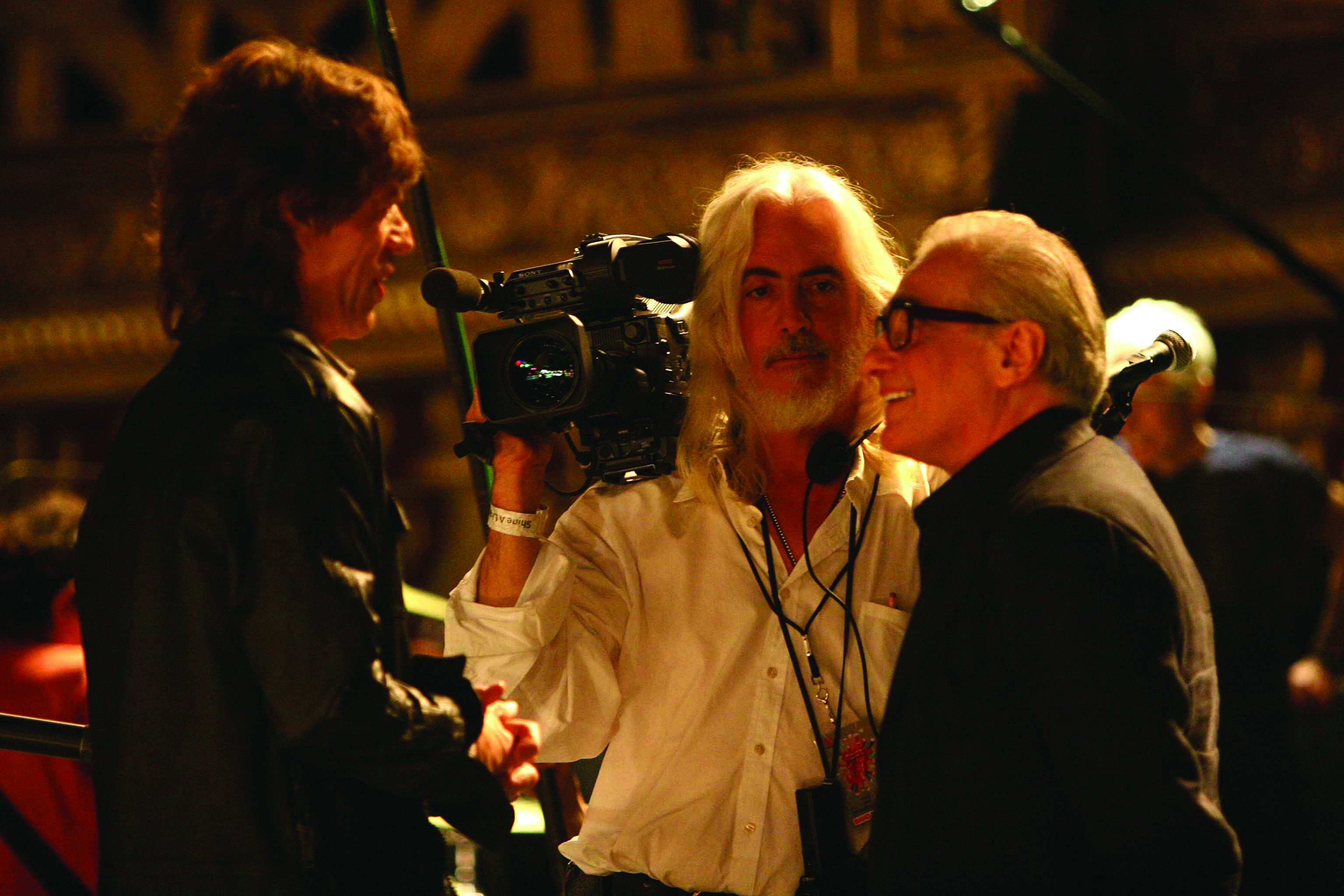
Colorists on
Richardson
By Iain
Marcks
Élodie Ichter
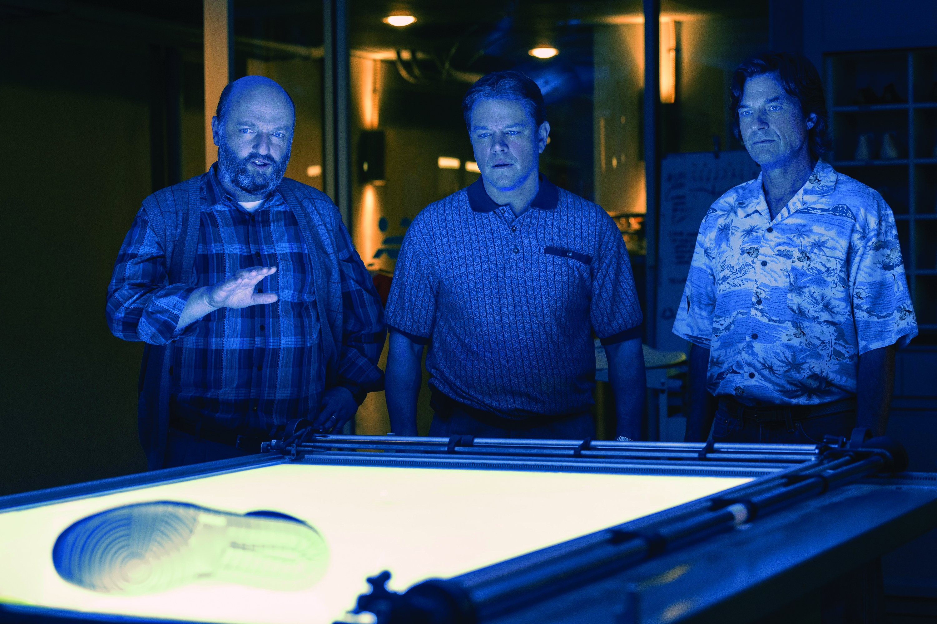
(Venom: Let There Be Carnage, Air)
Bob knows exactly what he wants, and is also open to suggestions. We start with a conversation about the general look of the show, which gets more specific scene by scene. Doing dailies for Bob on multiple projects has allowed us to develop the look while shooting. By the time we start the final color process, we know what’s needed and fine-tune the image together. Over the years, we’ve developed a relationship that facilitates our work together. It’s almost a game during the DI to see who will be first to express the same idea — adding a window here or removing a point of red there.
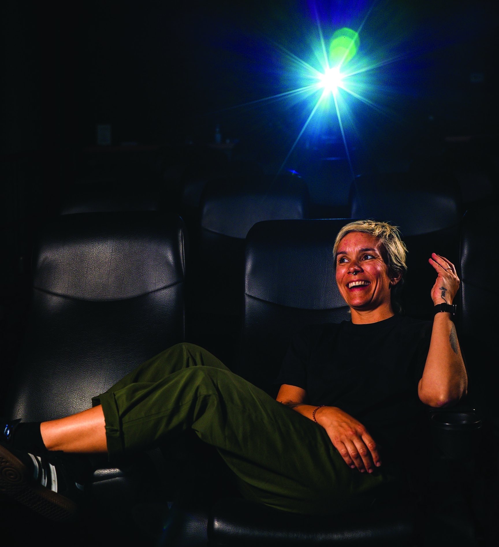
The first step is understanding the image — the lighting, color, direction of the light, density and what’s in the frame. As a colorist, you have the power to modify the image drastically. Our technology is creatively freeing, but it can be damaging if you’re not in control. It’s like having a superpower machine, but only for delicate enhancements of what’s been shot.
We do have influence over the image, and a collaboration between colorist and
cinematographer makes a huge difference, but everything starts with the cinematographer: They give us the material to work with. It’s a privilege to work with Bob because the process is fun and the material is already beautiful. I’m not trying to fix anything; it’s all about enhancing and creating.
Yvan Lucas
(Shutter Island, Inglorious Basterds, Django Unchained, Once Upon a Time... in
Hollywood)
I first met Bob to prep a movie which ultimately did not happen, but my color test convinced him to work with me in the future, starting with The Four Feathers [AC Oct. ’02]. After I joined EFilm in L.A., Bob wanted to send me a color-negative test for Shutter Island. The film needed two looks: a Kodachrome look and an emulation of the ENR silver-retention process. I created the LUTs and sent a filmout positive to Boston; Bob said that Marty [Scorsese] shouted for joy when he saw the test. The movie came to EFilm, where I supervised dailies and did the DI. We’ve since done many films together, including Inglorious Basterds and others for Quentin Tarantino.

Even if shot on film, a movie can look unlike film if you do post digitally and aren’t
careful to preserve that film look. On Once Upon a Time... in Hollywood, digital and film-print versions had to be identical. Bob is probably the DoP most demanding about his dailies. They were printed at FotoKem, where I’d watch them every day; then I’d work on 4K scans to match the digital and print dailies exactly, which can be more complicated than it sounds. People commented on the movie’s ‘vintage’ look, but that was, in great part, the result of primarily using the digital work to match a real photochemical process.
Stephen Nakamura
(Kill Bill 1 and 2, The Aviator, The Good Shepherd, Shine a Light)
I started working with Bob around 2002, when Technicolor opened their digital color-correction wing, Technique. On The Aviator, he aggressively used power windows and massive vignettes to reshape the lighting. Everything he tried was, of course, in service of the storytelling, and that’s also my focus as a colorist. I look at the lighting, the actors’ performances, costume design, production design, editing — everything — and think about the emotions the director is trying to convey in the scene. I take cues from the dailies, which reflect how the cinematographer envisioned the scene, and then I’m given free rein to do what I think is best.
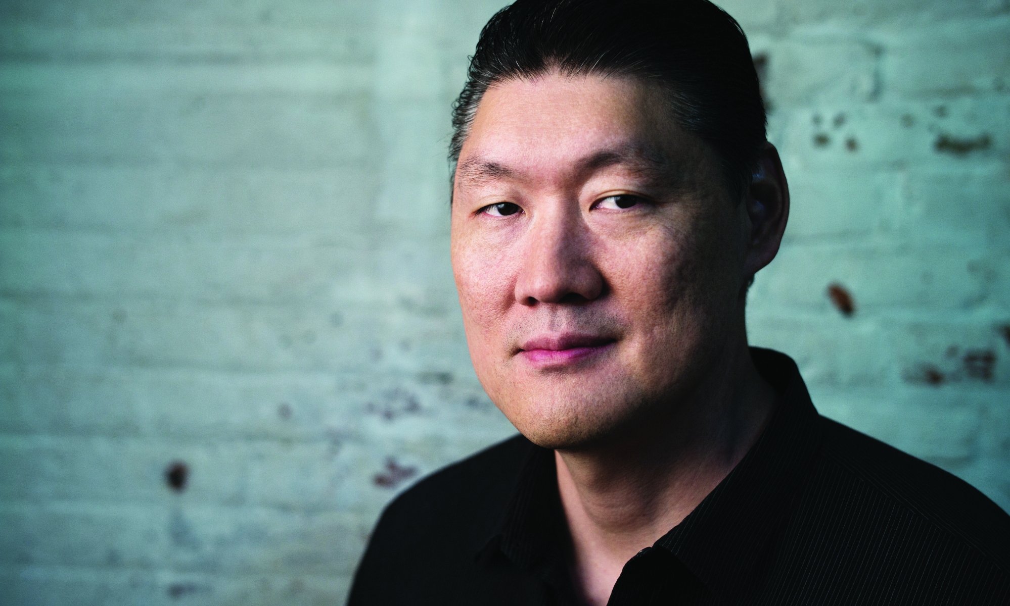
The colorist’s role on big studio projects isn’t just about color; it’s also about navigating the politics of the fin-ishing process. There’s a whole finishing machine that comes into play where many people get involved in creative decisions. Everyone from the director to the studio knows you can make a global adjustment to the entire movie in less than 10 seconds, so cinematographers like Bob — the A-list cinematographers who are always working and sometimes don’t have the time to be a part of the finishing process — have to trust that we’re going to push their vision through, find solutions when there are disagreements, and try to get everyone on the same page.
Stefan Sonnenfeld
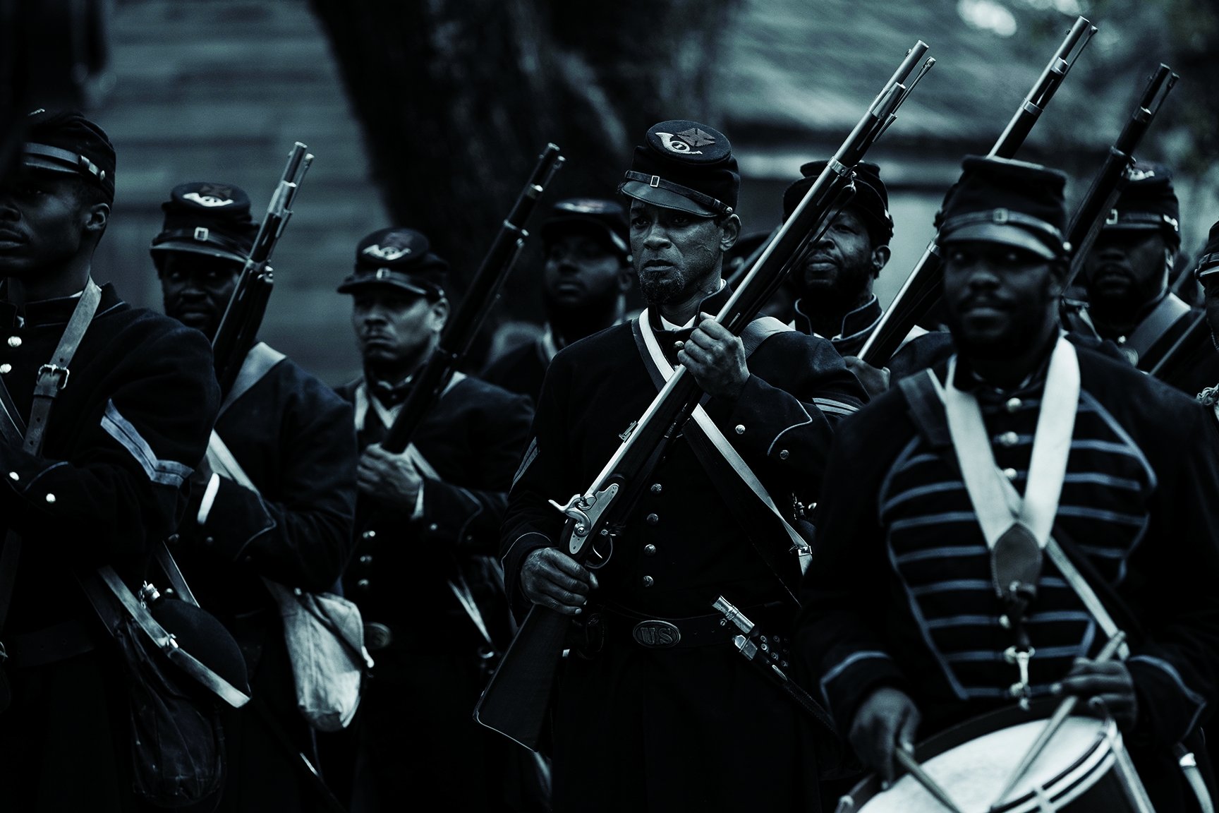
(Emancipation, The Equalizer 3)
As a colorist, it’s my job to help the creative team come up with the look, feel and emotional tone they want to evoke from the imagery — and [determine] how best to do that. There are many ways to achieve these goals with the technical tools we have today, but it’s important to keep in mind that it’s a collaborative process — a team sport, more than ever, from the colorists working with Bob on set to the person making the deliverables. It’s a well-choreographed dance between many departments. Some cinematographers have said it’s one of the most enjoyable parts of their job: sitting in a dark room, calming down and creating. It can get hectic with long days and nights, but by and large, it’s a beautifully symbiotic process.
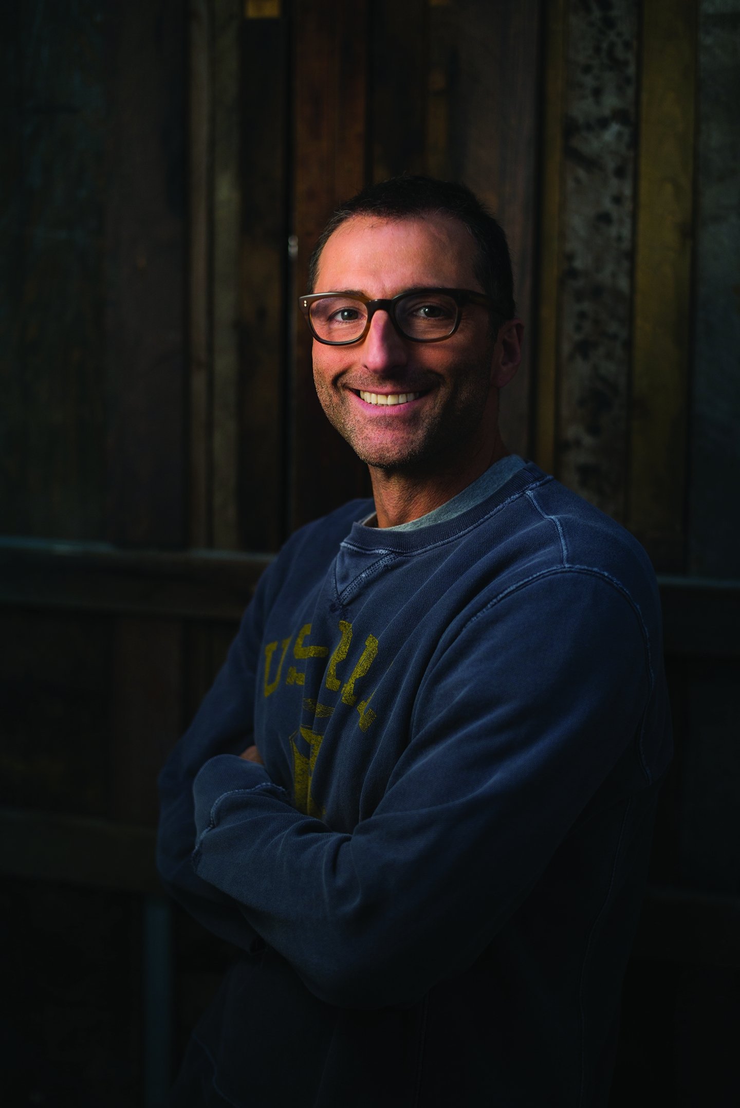
Bob is so unique and creative, and he constantly pushes everyone involved to a place they might not otherwise go. He knows you have to push the boundaries to get to a place that’s best for the project. If we just did a nice, standard grade and moved on, we wouldn’t reach the potential the project deserves. When genuine filmmakers of Bob’s caliber bring out the best in you, you produce better work for everyone. The directors and DPs who allow collaboration across all departments — whether it’s production design, casting, sets, stunts, whatever — are the ones who get the best product.

